Role: Senior Product Designer · UI Leadership
Duration: 4 months
Discount Portal, Laboratorio Chile
Role: Senior Product Designer · UI Leadership
Duration: 4 months
Laboratorio Chile, part of the Teva group, is the country’s leading medicine manufacturer. The laboratory wanted to create a public, mobile-first portal where patients and healthcare professionals could look up its products and the discounts available under its different discount programs.
The Challenge
In Chile, medicines are particularly expensive for people. That’s why discount programs are a high-value support, especially for chronic patients, who have to buy their medication month after month.
Laboratorio Chile’s medicines are discounted through several programs: Chile Salud, Fonasa (public health insurance), GES (guaranteed health coverage), pharmacy loyalty clubs, and special discounts. However, the information about them is scattered, and each program has its own rules and formats. In practice, patients depend on whatever they are offered at the pharmacy counter.

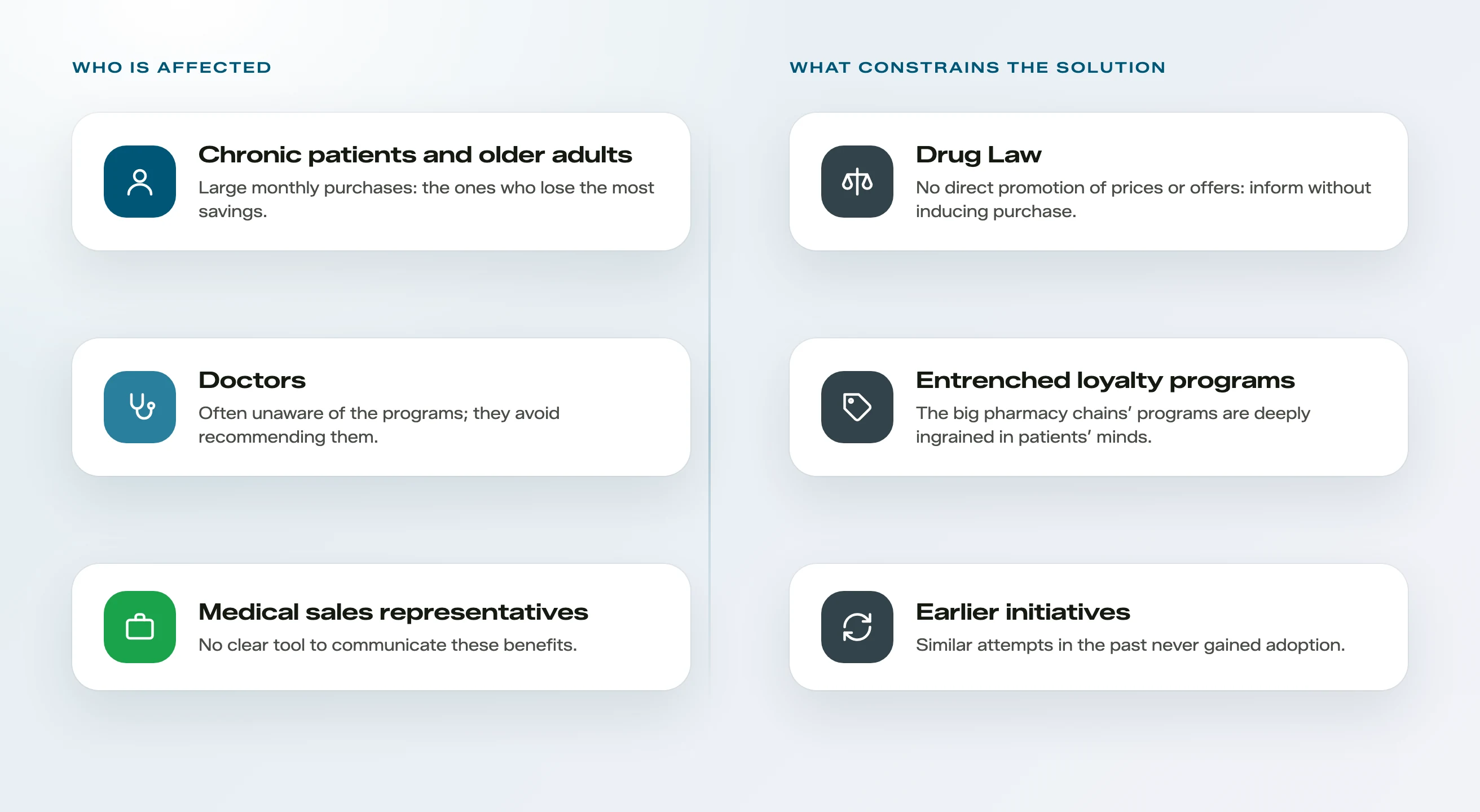
This scenario affects three groups of people:
On top of this, there were significant constraints:
The Solution
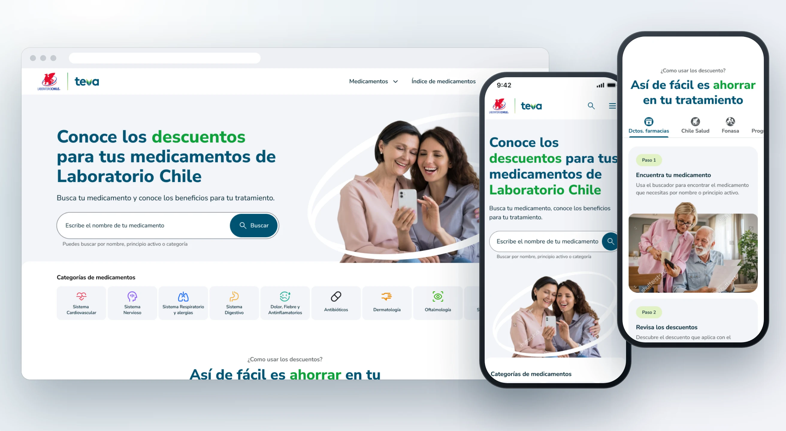
We designed a portal that goes beyond information. It brings together in one place everything a patient needs to know about their medication: what it is for, which discounts it has, how to redeem them, and where to buy it.

01
Findability:
Redesign of the medication categorization so each product can be found through different paths, aligned with how users actually search.
02
Benefit clarity:
A consistent system to communicate highly heterogeneous discounts, giving visibility to every program available for each medication.
03
From data to action:
A portal that goes beyond information: it explains how to redeem each discount and where to buy the medication based on the user’s location.
04
Accessibility:
An experience designed for older adults and chronic patients, with clear, friendly medication information available in different formats.
Process and My Contribution
Building the Right Thing
Building It Right
Building the Right Thing
Kickoff
Research
Definition
Building It Right
Design
Impact
lead
contributor
support
Building the Right Thing
support
The project began with a kickoff between the Match team and Laboratorio Chile’s stakeholders to align the approach. From there, the research ran on two fronts:
Research results are confidential.
Definition
contributor
The findings were translated into a pyramid of needs with three levels: the basics, the valued, and the surprising. This pyramid shaped the MVP scope and laid out an evolutionary vision for later stages.

Building It Right
lead
With the scope defined, we designed the portal’s complete experience for mobile and desktop: home, categories, listings, product page, and usage guides for the discount programs. Accessibility was a cross-cutting criterion, given that a significant part of the audience is older adults.
The prototype was validated with users and iterated based on the findings. Finally, handoff and UX QA were carried out together with the development team to ensure implementation fidelity.
Categories and Search
lead
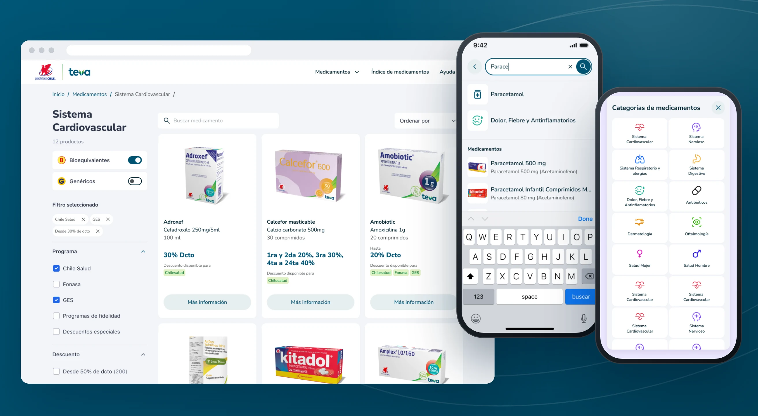
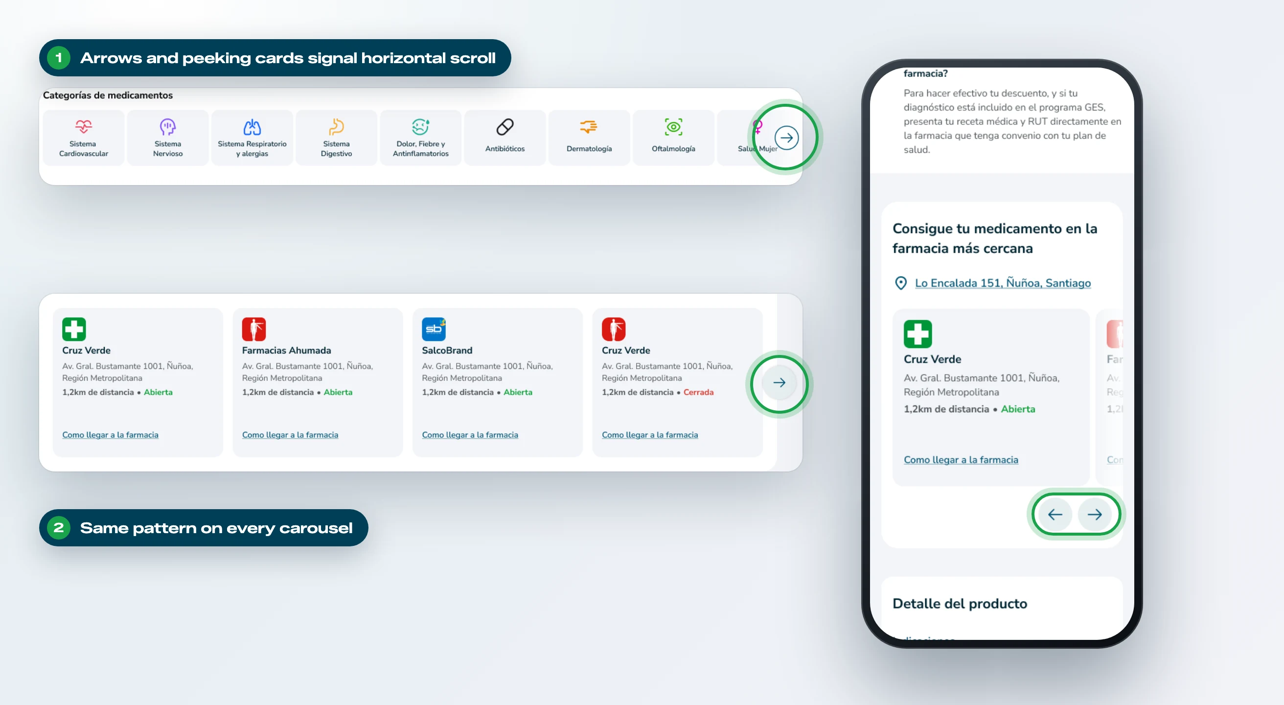
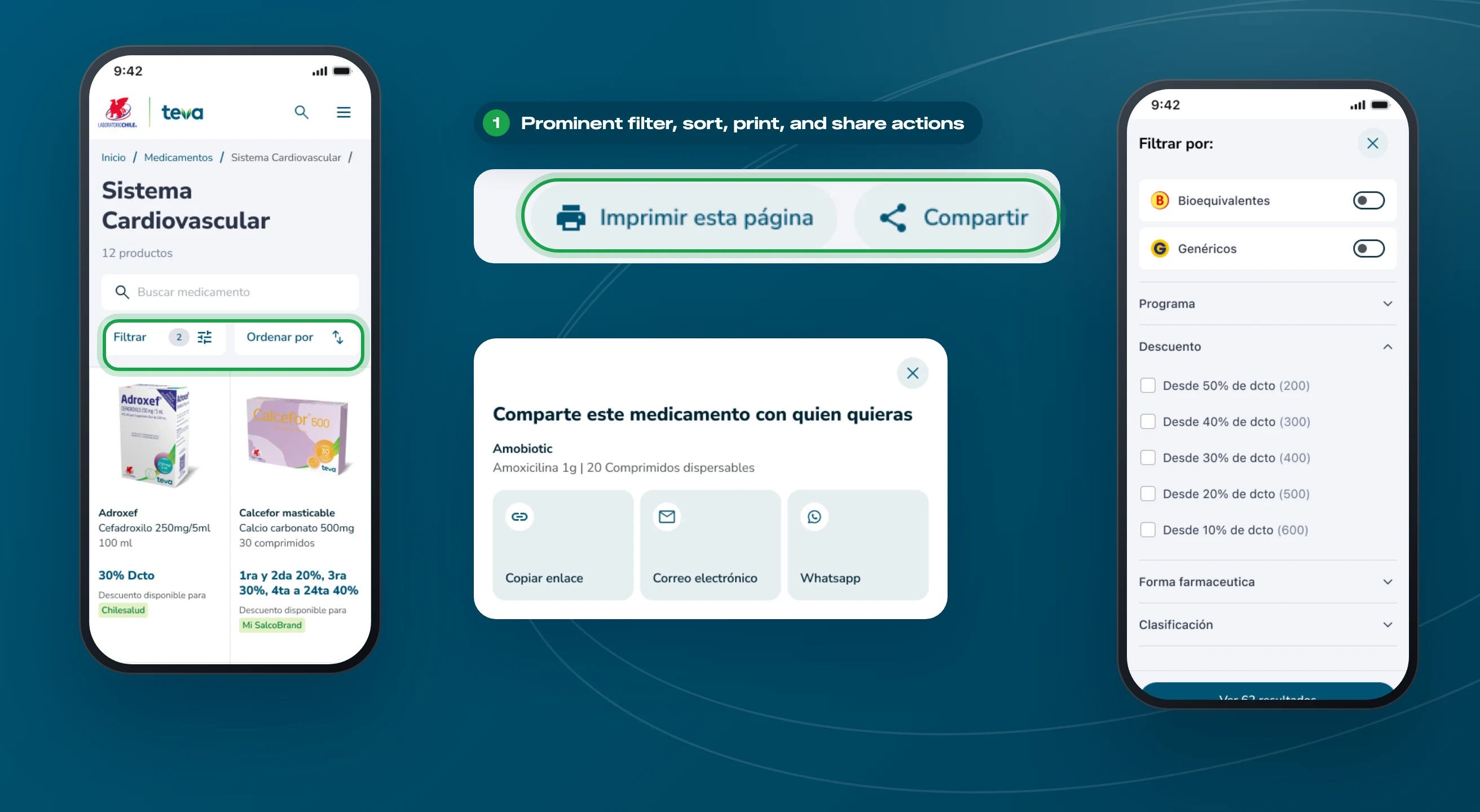
We redesigned the categorization so each medication can be found by name, active ingredient, therapeutic category, or alphabetical index. In listings, users can refine results by discount program, discount range, pharmaceutical form, classification, bioequivalence, and generics. This improves the traceability of each product and reduces the search effort for people who don’t remember the exact name of their medication.
Product Card
lead
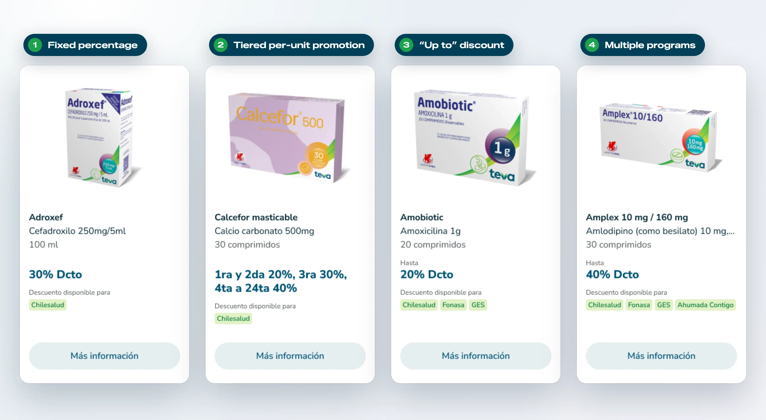
One of the main design challenges was building a consistent product card capable of clearly showing highly heterogeneous information: fixed percentages, “up to” discounts, tiered per-unit promotions, and multiple programs associated with the same drug. The resulting component absorbs all those variants while keeping a stable reading hierarchy, which makes it possible to compare products at a glance.
Product Page
lead
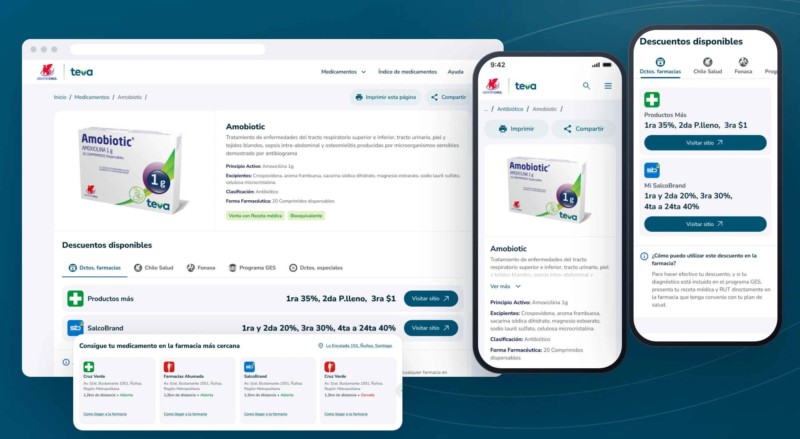
The product page consolidates all the relevant medication information in one place:
Discount Guide
lead
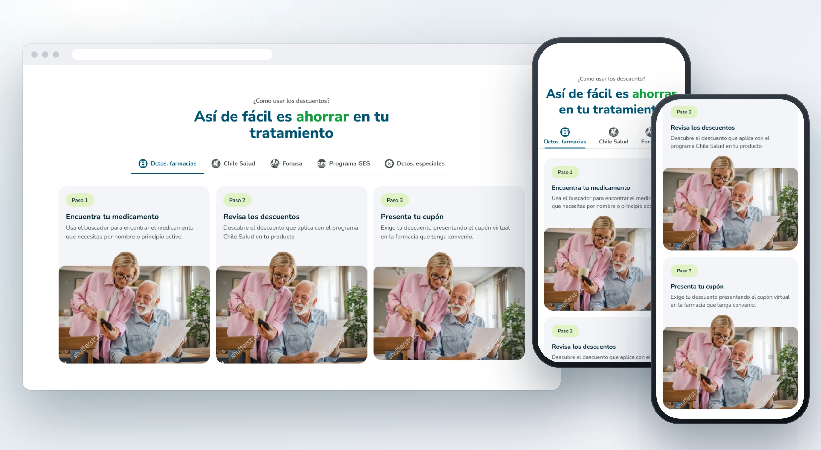
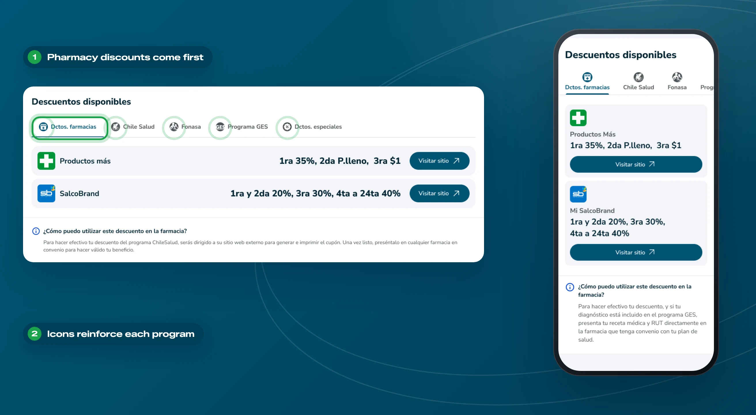
For each type of program, a three-step flow (find your medication, review the discounts, present your coupon) explains in a simple, friendly way how to access the benefit. This reduces uncertainty at one of the most confusing points for patients.
Usability Testing
lead
The prototype was validated in remote moderated sessions with ten participants: five older adults and five chronic patients under 60. Participants identified the site’s purpose without any prior explanation and completed most tasks with ease.
The test also revealed opportunities for improvement:
Based on these findings, the prototype was iterated. For example, pharmacy discounts became the first tab, and the program tabs gained iconography to reinforce their relationship with the content.
Results
00%
Results will be added soon
00%
Results will be added soon
00%
Results will be added soon
Project still under construction