Role: Senior Product Designer · UI Leadership
Duration: 4 months
Chiletur, Copec
Role: Senior Product Designer · UI Leadership
Duration: 4 months
Chiletur is Copec's tourism app, with more than 350,000 downloads. It's part of Copec's digital ecosystem as a product designed to guide users through planning and experiencing their trips across the country.
The Challenge
The app had two simultaneous problems. On one hand, an information architecture problem: the content taxonomy was too general — without granular-enough categorization by city, attraction, or activity type — which limited search precision and made it harder for users to find what they were looking for. On the other, an interface design problem: the app hadn't been updated in years, with an outdated UI misaligned with the rest of Copec's visual ecosystem.
The problem affected the app's entire user base. Solving it meant not only redefining the content structure, but also redesigning search and indexing criteria at the product level — which required close, sustained collaboration with Copec's development and content teams.
The Solution
The project was tackled on two complementary fronts:
Information architecture and search engine: Redesigned the category taxonomy (region, city, destination, activity, must-see) to enable more precise searches aligned with users' actual behavior.
Full visual redesign: Complete update of the UI system, aligning Chiletur with Copec's Design System and integrating graphic elements native to the product's local identity.
Process and My Contribution
Building the Right Thing
Building It Right
Building the Right Thing
Kickoff
Research
Definition
Building It Right
Design
Impact
lead
contributor
support
Building the Right Thing
lead
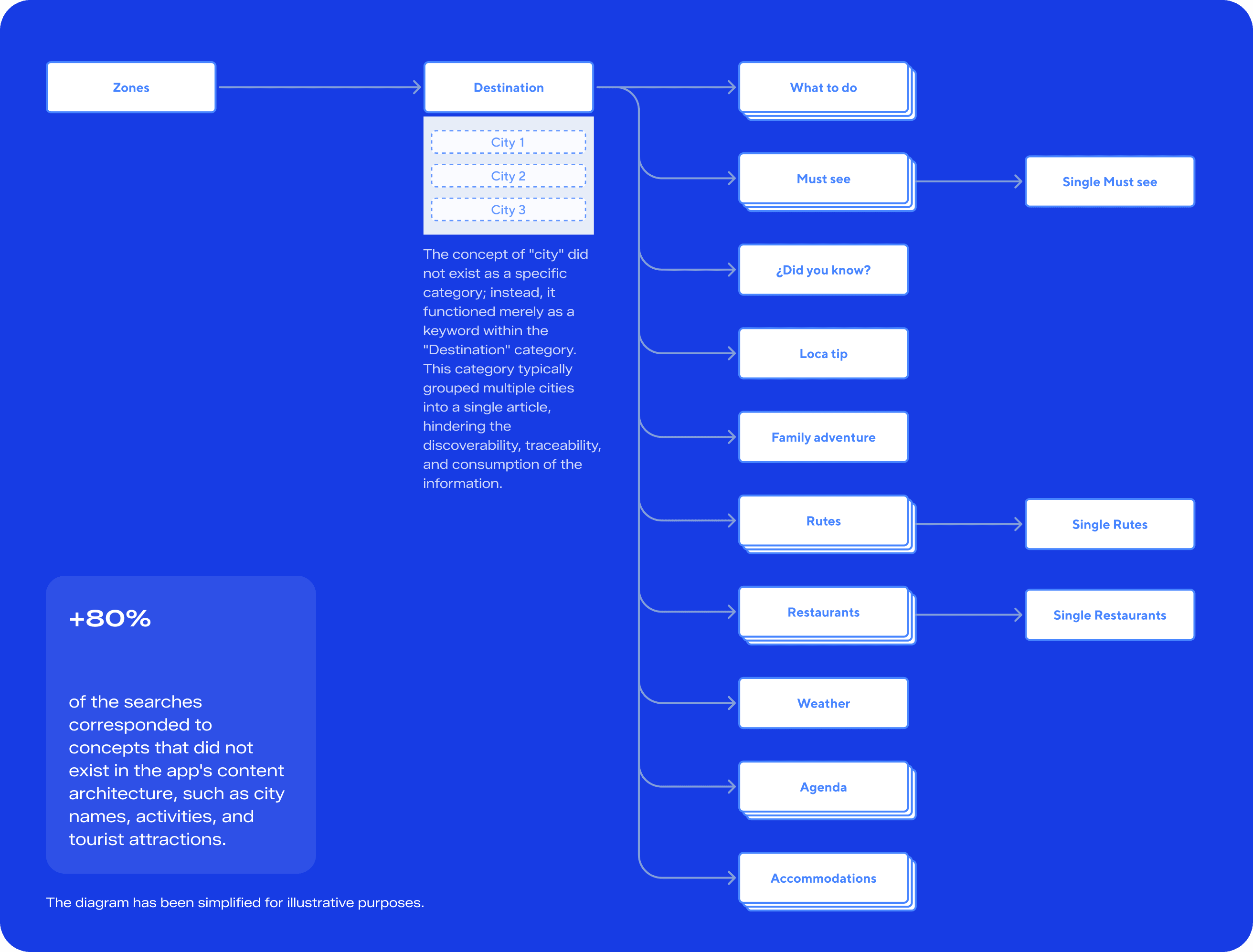
The starting point was an analysis of in-app search behavior data, which showed that information was structured at a level of generality that didn't match users' actual search patterns — whether by city, activity, or specific attraction. Based on this diagnosis, a workshop was held with the Copec team to define how content should be structured and tagged to be compatible with the new indexing criteria to be implemented at the search-engine level.
Definition
support
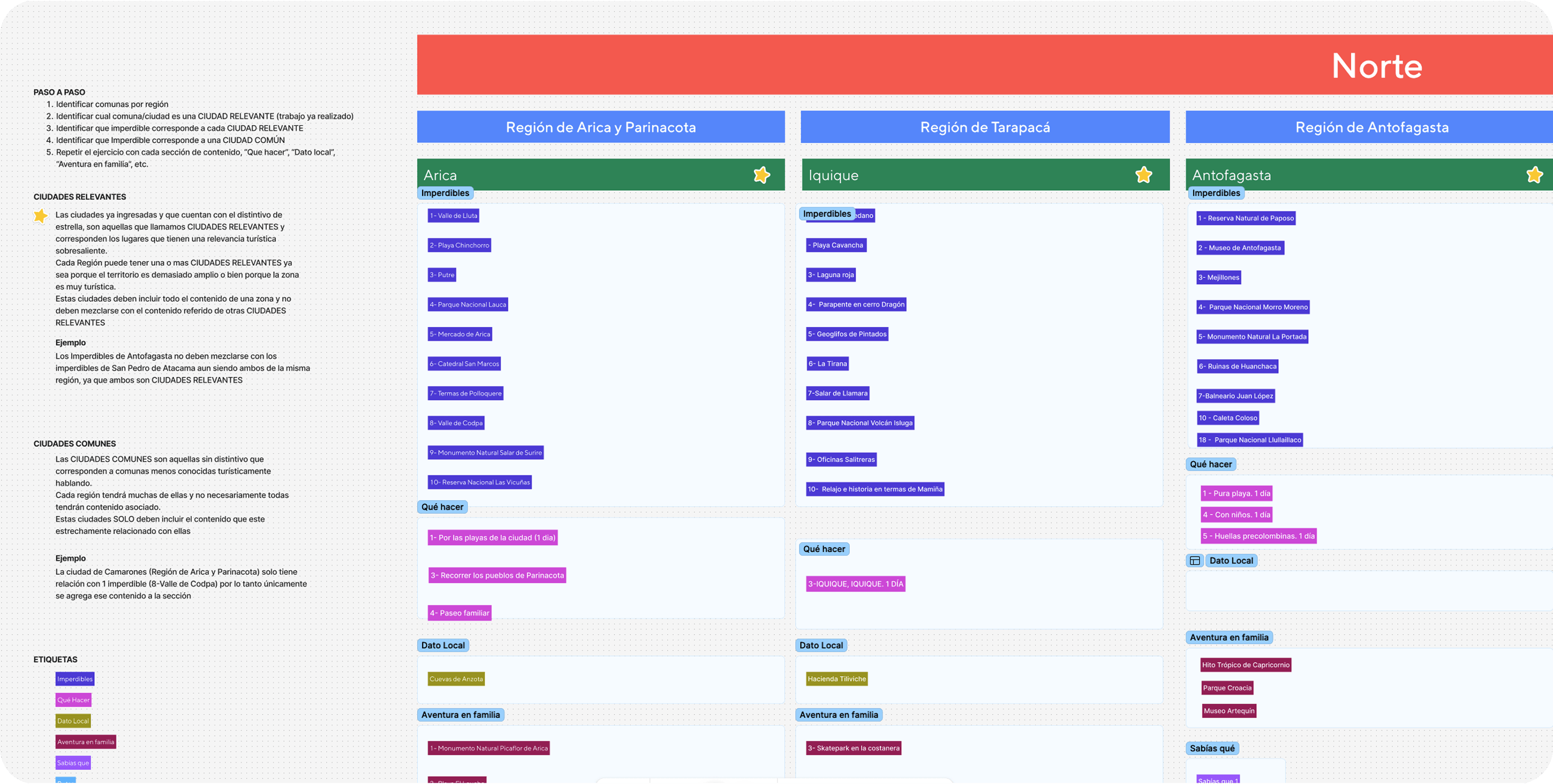
With the diagnosis validated, the work moved into redesigning the app's information architecture at the taxonomy level. Flow diagrams were developed comparing the existing structure against different proposals for a more granular hierarchy, evaluating how this specificity could be consistently maintained across the different search entry points (by region, by city, by destination). The final proposal — a more detailed and scalable content structure — was validated and adopted as the basis for the product redesign.
Building It Right
lead
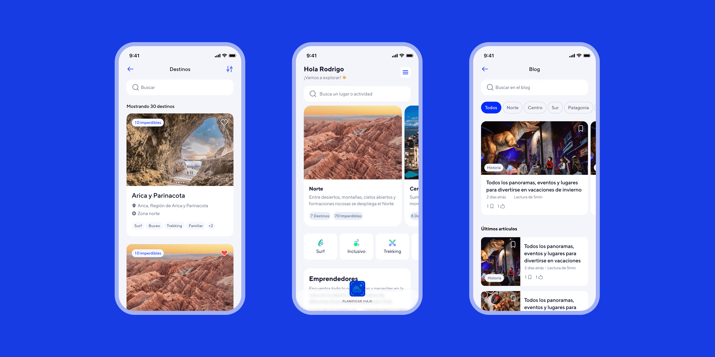
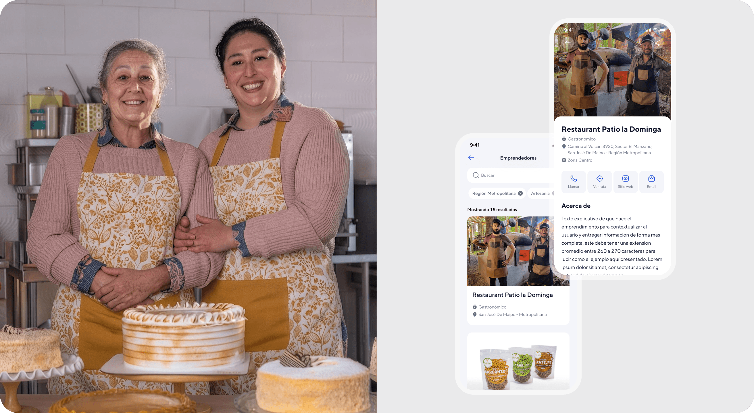
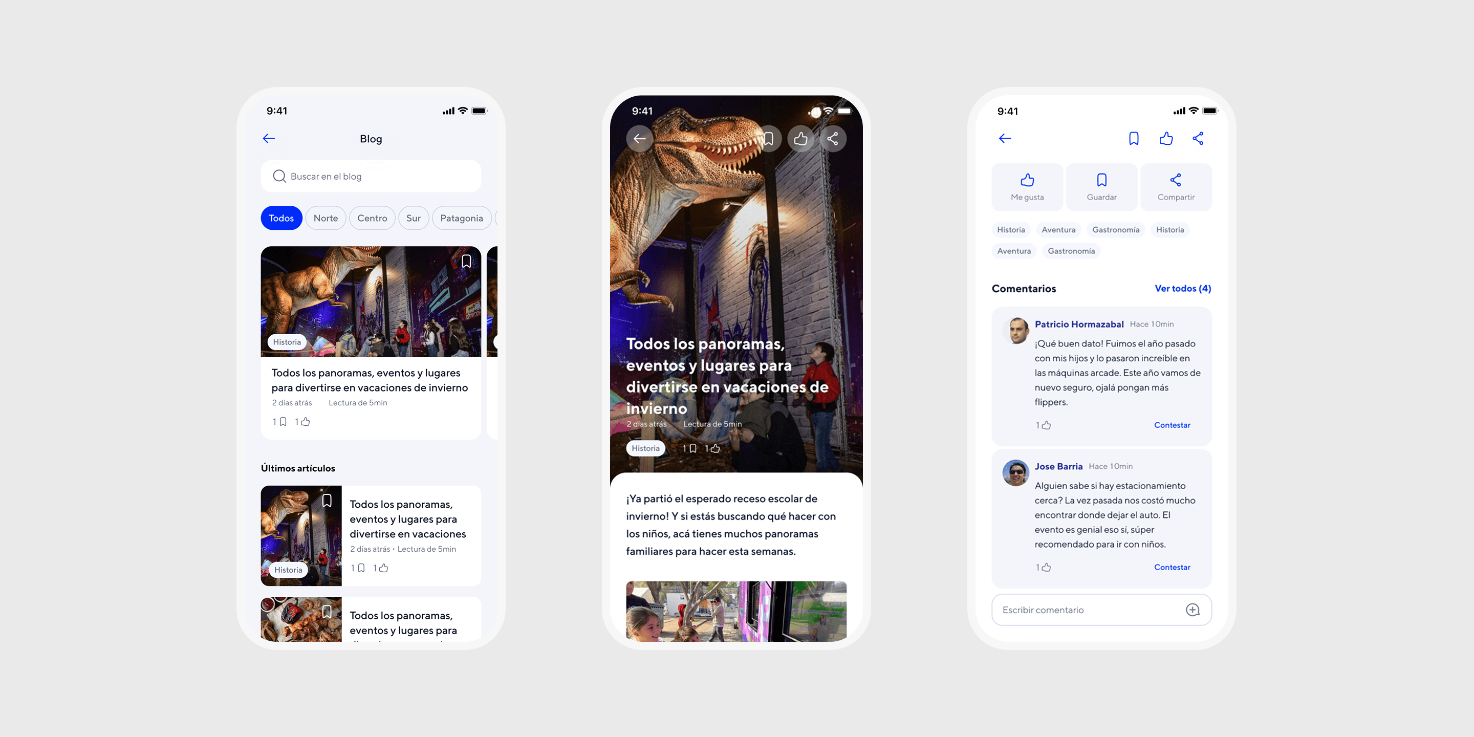
In parallel, a complete interface redesign was undertaken, aligning Chiletur with Copec's Design System components and visual tokens, and incorporating graphic elements native to the product's local identity. The work covered the app's full flow — search, destination pages, routes, trip planner, entrepreneur directory, blog, profile — with a responsive approach. Handoff and QA were done directly with the development team to ensure implementation fidelity against the new UI specs.
Trip Planner
lead
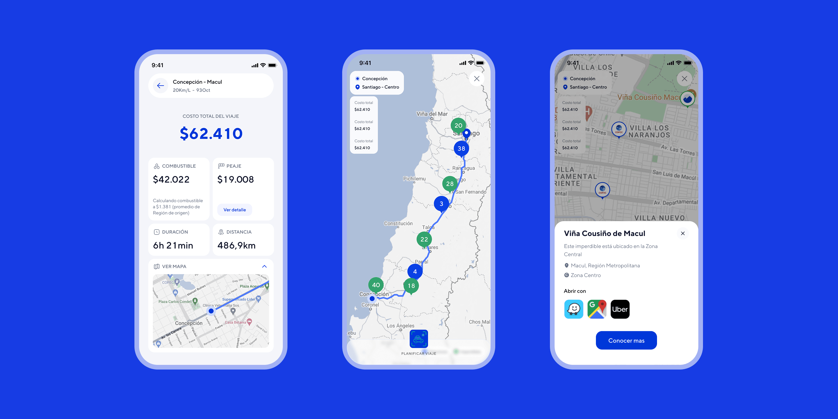
The planner has a primary goal — calculate the trip's approximate cost (fuel, tolls, total cost) and suggest a route based on origin, destination, and vehicle variables (fuel efficiency and fuel type) — and a secondary goal: turn the resulting map into an interactive element that would create synergy with the rest of the app's content. Along the suggested route, users can discover gas stations, must-sees, local entrepreneurs, and destinations near the route, connecting the functional utility of trip calculation with the editorial discovery content that had been restructured at the information-architecture level.
Destination Page
lead
The destination page is where detailed content is displayed within the new information architecture, and each destination belongs to a zone (e.g., North, Central, South, Patagonia) that groups together a set of related destinations. Within the page, a single-scroll structure organizes: climate and best time to visit, available activities, things to do, local must-sees, related routes, event calendar, and dining and lodging recommendations. The visual hierarchy and order of these modules were defined so users could move from general exploration — at the zone level — to a concrete decision within a specific destination (where to eat, where to stay, what to do), directly solving the original problem of scattered, unspecific content.
Results
4.6
User rating on the digital app stores
+360K
Downloads
+2.4
Improvement in user ratings since the launch of the new design